
Internal Tool for Estimators, Adjusters, and Customer Service Operators
Combining various specialized software tools into an easy-to-use portal for all things related to vehicle claims.
In the car claims world, every minute a car stays in the shop after an accident costs money for the insurance companies and causes frustrations for the customer. The better the communication between the insurance companies and the customers is, the happier everyone is and the quicker the claim can be taken care of. This project focused on creating a new software that combines the existing portals to assist everyone in the process of taking care of a car. Ensuring happy customers and happy workers.
Initial Research
In order to gather information on the processes involved in a vehicle claim, I pioneered an initiative to shadow our in-house Customer Service agents, Estimators, and Adjusters and record what screens they spent their time on and how long it took them to find certain information. Through this initiative, designers could have documentation for future products as well. As part as this project, I did my own shadowing and looked at the notes from other designers and focused on paying attention to the actions they were doing on screen.
MVP Screens
There were many different views that were being utilized in a the vehicle claim process. The two views that were used by our in-house employees were the Assignments and the Supplemental screens. These are the ones that we focused on for the MVP.
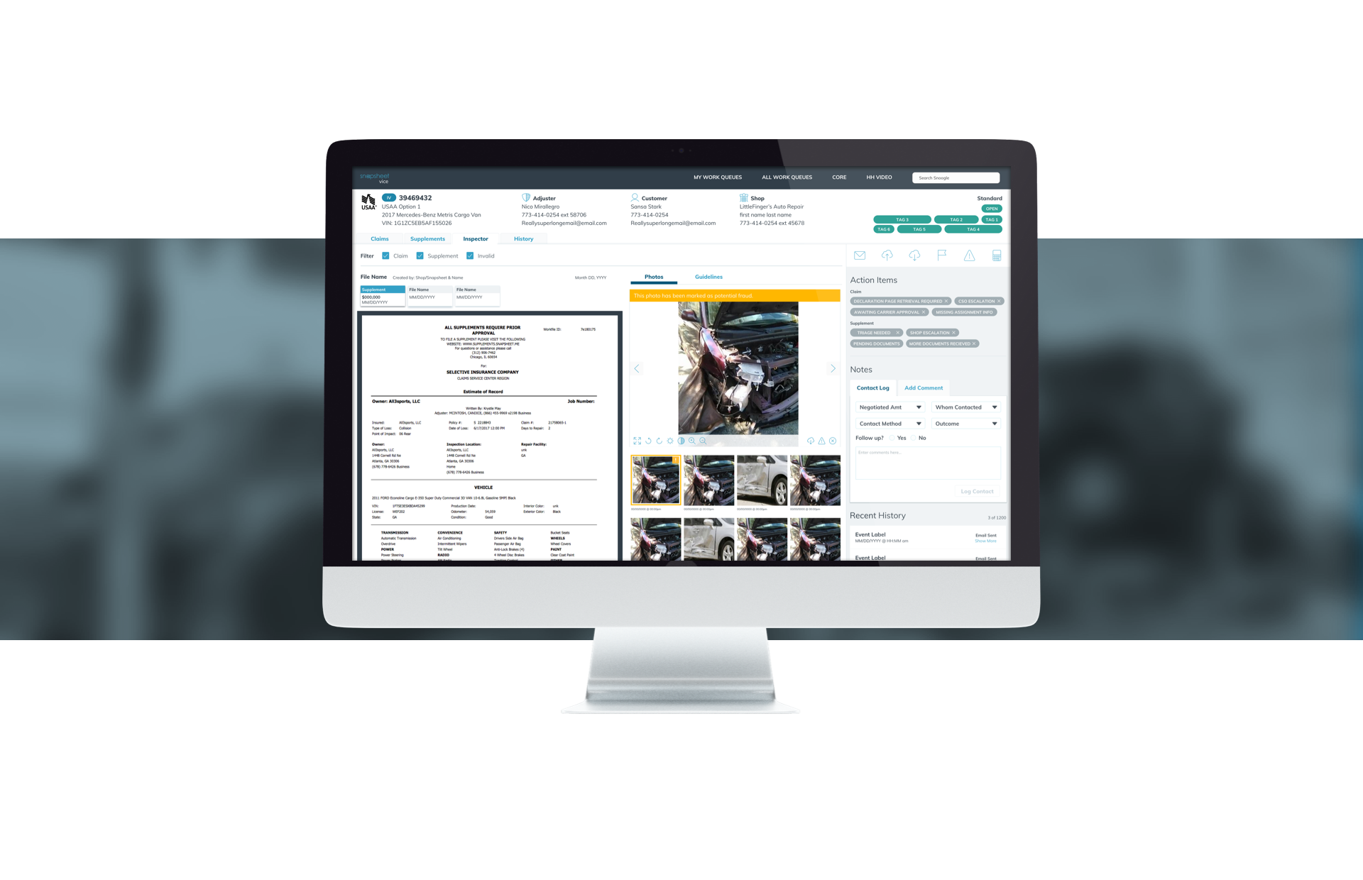
ASSIGNMENT SCREEN
A typical customer service agent spends most of their time looking at the Assignments tab to understand the images, flag them as potential fraud, ensure all the information for the customer is in place, leave comments, and take a look at the history logs.
SUPPLEMENT SCREEN
If a vehicle has supplemental damage, the estimators and customer service agents spend their time in the Supplements Screen. This is where the Estimators put the negotiated prices and where anyone can put in the shop name and information.
New Design
With the information gathered in our shadowing, we decided on a simplified view that aggregates several of the possible actions into one screen. We realized many important features like History and Contact log were usually ‘Below the Fold’ and the Customer Service Agents mentioned they had one of their biggest pain points in scrolling all the way down to do their first task of looking at the history and notes from previous Customer Service Agents.
SUPPLEMENT SCREEN
ASSIGNMENT SCREEN (RENAMED INSPECTOR)
Testing
When we got to a good point with our design, we decided the best way to gauge if we were on the correct track, was to do some user testing. In order to do that, we tested 5 Customer Service Agents and 5 Negotiators through common task for in their workflow.
TOOLS
We used InVision for the prototype. We felt the fidelity was perfect for our task and it allowed us to share it easily with team members.
To record our tester’s screens, we used Zoom. This also recorded their audio as they spoke their thoughts out loud.
I created a script in Google Docs.
I created a spreadsheet for documenting the testing in Excel and had it color code depending on difficulty of task.
SCRIPT
When creating the script, I used the knowledge gained from the shadowing and had meeting with the stakeholders to decided what the common procedures were. I created tasks based off those procedures for them to test.
DOCUMENTATION
As the testers went through the tasks, I documented their success in the excel spreadsheet I had created. I also documented their comments as well as my observations as they were using the prototype. The key I used for difficulty was: 0=tester easily completed task 1=Tester struggled with task 2=Tester was unable to complete task. The last column in the spreadsheet was adding the difficulty of the individual steps necessary to complete the task for an overall difficulty level to that task. It the stronger the color red, the harder that task was.
SUMMARY
After we had finished our testing sessions, I looked at the documentation and found the correlations and pain points for the users. I wrote this up and presented it to the stakeholders and the rest of the design team. With this information, we were able to make some changes and start having conversations on finalization of features for the first version of the new designs.
Reception
The reception to the new design was overwhelmingly positive. We had beta testers while we created training materials to hand out to the rest of the company. Many of the comments we received were about the cleanliness of the new design and the efficiency of finding information.