
Vice Vehicle Claims Portal
Snapsheet
Creating an easy-to-use platform for Adjusters, Customer Service, and Estimators to streamline the vehicle claims process.

Snapsheet’s core product was clunky and inefficient, making it hard for the support team to find critical information quickly. This led to delays, frustrated users, and increased costs as vehicles sat in shops longer than necessary.
CHALLENGE
Designed new platform using insights from user shadowing to guide a modified Design Sprint, focusing on consolidating tools into a single, streamlined platform. The new experience simplified interactions, improved visibility, and reduced friction by 20% across the claims process.
SOLUTION
ROLE
Design Lead
TIMELINE
8 Months
TEAM
1 Product Owner, 3 Full-Stack Engineers, 2 Designers
SCOPE
Desktop

Company Overview
Snapsheet is a SaaS startup that helps insurance companies handle claims faster by connecting adjusters, estimators, body shops, and customer service reps in one portal. With tools like photo-based damage assessment, a parts inventory, and a dedicated support team, we became a trusted partner for USAA, Nationwide, Turo, and Liberty Mutual.
Key Responsibilities
Created and led design research and shadowing to ensure our designs worked.
Guided junior designer through collaborative sessions to create peripheral screens off my designs.
Collaborated with stakeholders and developers on feasibility of designs.
Process
I led this 8 month project from research to launch. We used a modified version of Google’s Design Sprints, and focused our efforts on quick design iterations with a strong focus on validation and testing with our users. I met weekly with the development and product team to ensure our expectations were aligned.

SHADOWING

ALIGNMENT

DESIGN SPRINTS

VALIDATION
Shadowing our Users
I planned and organized weekly shadowing sessions for designers and engineers over the course of one month to understand the purpose, opportunity, and challenges when claims are received and process they go through.
Adjusters handle the negotiations between what the estimator and body shop input. They act as the insurance company and are ultimately responsible for a vehicles repair.
10 ADJUSTERS
Sample questions:
What are you most concerned about during the process?
How often do you engage with the portal and review the work?
What are the biggest challenges in your line of work?
Estimators rely on experience to input repair costs based on local parts and labor rates. Our challenge was finding a way to capture and support that expertise within the product.
10 ESTIMATORS
Sample questions:
How long does a typical estimation take?
What challenges do you have when inputing an estimate?
What information do you need in order to do your job well?
Customer Service was the main contact for all our users. They needed to know what state a claim was in and what the next steps were.
20 CUSTOMER SERVICE REPS
Sample questions:
What are the most commonly used features?
What are the typical service calls you get?
How are you communicating with your team?
Pain Point Alignment
Shadowing and analysis revealed that Estimators and Customer Service reps were spending too much time searching for information before they could take action, due to scattered data and unclear workflows.
The claim status, fraud flags, and missing information were often unclear, forcing users to make quick judgment calls while on the phone with customers.
UNCLEAR STATUS
The company used 16:9 monitors, which meant key information often fell below the fold, which made it harder for users to find what they needed quickly.
BELOW THE FOLD INFORMATION
Customer service agents frequently rotated, so the person handling a claim often wasn’t the one who started it. Easy access to notes and claim history was crucial but the current system didn’t allow that.
HIDDEN HISTORY
Users often had to search for information on the screen, and when navigating away, they struggled to find their way back, leading to confusion and lost time.
HIERARCHY GONE WRONG
MVP Screens
We identified the two primary views our users relied on and focused our design sprints and testing on improving them.
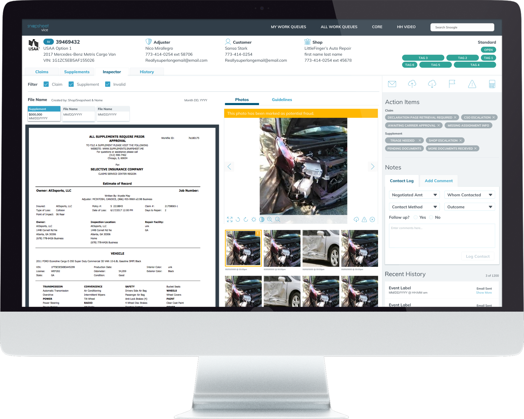
ASSIGNMENT SCREEN
A typical customer service agent spends 85% of their time looking at the Assignments tab to understand the images, flag them as potential fraud and ensure all the information for the customer is accurate while leaving comments for future users.
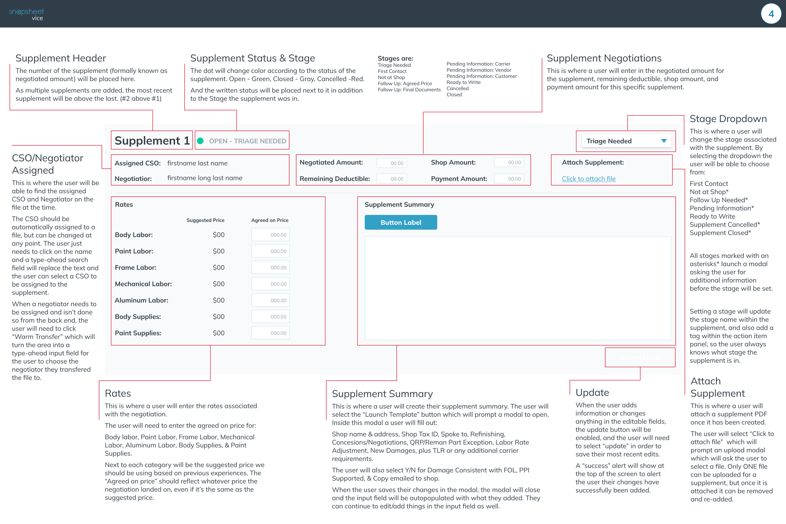
About 60% of vehicles has supplemental damage, some of them even have several supplemental quotes. In those cases, the estimators spend 98% of their time on the Supplements Screen. During the negotiations, customer service agents spend about 70% if their time here with adjusters spending 80% of their time.
SUPPLEMENT SCREEN
Design Sprints
We created quick wireframes and prototypes using our design system, inspired by Google’s Design Sprints. This allowed us to test, gather feedback, and iterate rapidly before moving to development.
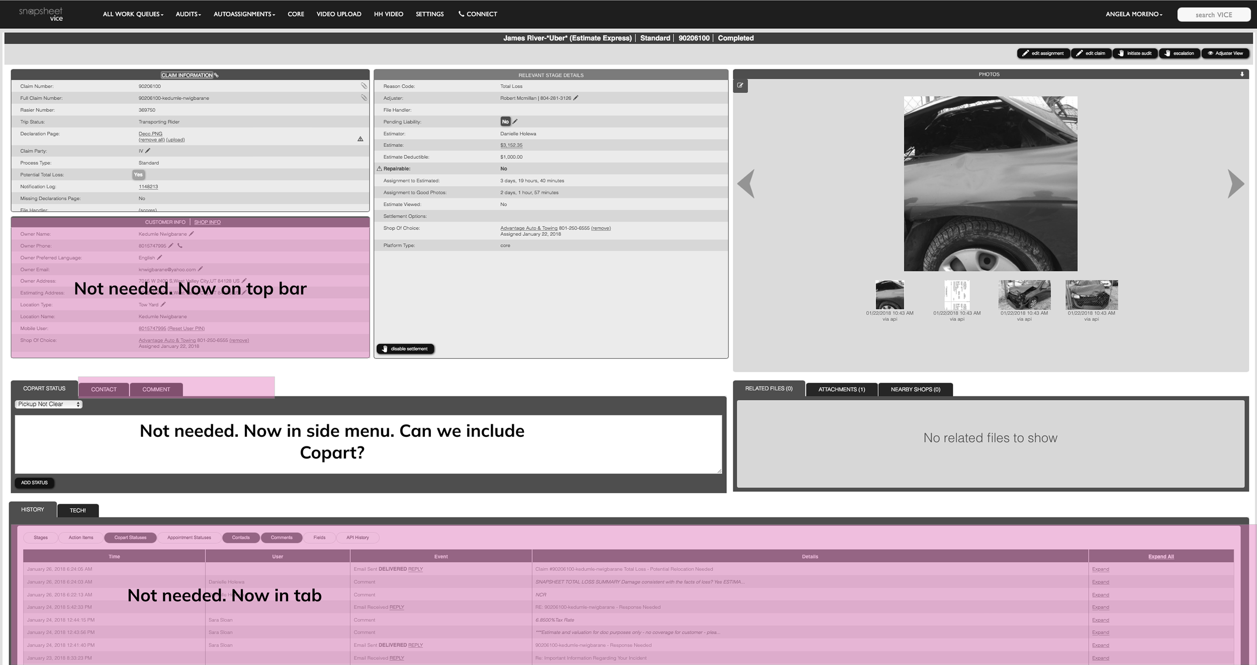
We did an audit of the existing platform to understand what we would need to keep and what we would need to remove.
AUDIT

Rather than fully detailed wireframes to iterate on, we used low-fidelity blockframes to explore content hierarchy and determine the ideal placement of key information.
HIERARCHY OF INFORMATION
We knew we wanted to include an Action Panel to surface the most up-to-date information, but it took several iterations to determine its ideal layout, size, and placement within the screen.
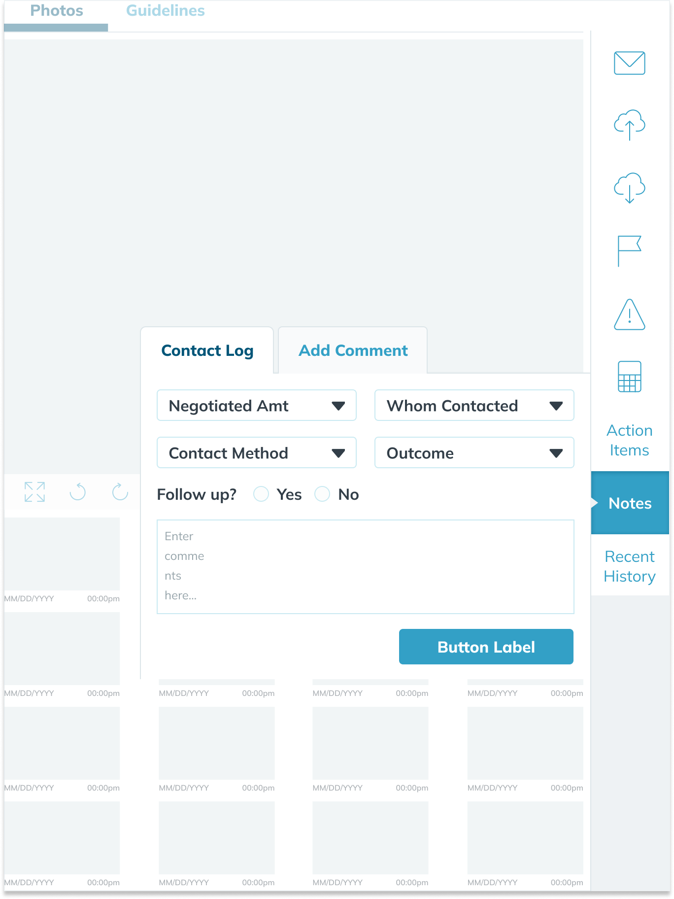

For the final designs, we decided on a simplified view that aggregates several of the possible actions into one screen without creating cognitive overload. We had the most relevant information always visible and organized information in a way that most of it was ‘above the fold’ with tabs to help move between content.
Final Iteration


SUPPLEMENT SCREEN
ASSIGNMENT SCREEN (INSPECTOR)
Validation
In order to ensure our designs worked well, we tested 5 Customer Service Agents and 5 Negotiators through common tasks in their workflow. During this time, our developers were starting their wireframes since we knew the general design direction.
TOOLS
We used InVision for the prototype. We felt the fidelity was perfect for our task and it allowed us to share it easily with team members.
To record our tester’s screens, we used Zoom. This also recorded their audio as they spoke their thoughts out loud.
I created a script in Google Docs.
I created a spreadsheet for documenting the testing in Excel and had it color code depending on difficulty of task.
SCRIPT
To ensure consistency and scalability across testing sessions, I created a detailed script that allowed other designers to confidently proctor the tests.
The script was based on insights gathered from shadowing sessions and meetings with stakeholders, where we identified the most common user workflows.
From there, I developed realistic task scenarios that aligned with those workflows, helping us gather meaningful, comparable feedback from each session.
As testers completed each task, I tracked their success and comments in a custom Excel spreadsheet, along with my own observations. I used a difficulty scale: 0 for easy, 1 for struggled, and 2 for unable to complete. I then calculated an overall difficulty score per task by summing the difficulty of each step, using a red color gradient to highlight the most challenging tasks.
Key Insights
After completing the testing sessions, I reviewed the documentation to identify user pain points and patterns. I summarized the findings and presented them to stakeholders and the design team, which led to key design adjustments and the launch of our improved software.
An unexpected theme emerged, 100% of users loved the action bar. This was great news for as it validated a large change from the previous experience.
LOVED THE ACTION BAR
75% of users had a hard time finding particular areas like Guidelines and Photos in the new tab system. We understood that training for this new software and documentation was very important.
BIG CHANGE = LOTS OF TRAINING
“I can already see this will improve my calls tremendously. Everything is so easy to read and scannable.”
Training & Reception
The response to the new design was overwhelmingly positive. While preparing training materials for company-wide rollout, we gathered feedback from beta testers who praised the clean layout and how much easier it was to find information.
Within the first month…
20%
Faster Claims handled
100%
User satisfaction

Personal Retrospective
OVERHAULS ARE CHALLENGING
Redesigning from the ground up can be intimidating, especially since users often struggle with change. But sometimes, rethinking the experience entirely, and investing in training, can lead to greater long-term success.
FLEXIBLE DESIGN PROCESS
Ideally, the design process includes detailed user flows and wireframes, but by using faster methods like Google Design Sprint-inspired iterations, we can quickly validate ideas and make impactful changes based on real user feedback.
tl;dr
Through user shadowing, rapid iteration, and testing we were able to redesigned Snapsheet’s core software and streamline the vehicle claims process. The updated experience boosted efficiency, improved user satisfaction, and helped grow our client base four our wide array of users that included customer service reps, adjusters, estimators, and ultimately, vehicle owners.