
Fan Loyalty Program
U.S. Soccer Federation
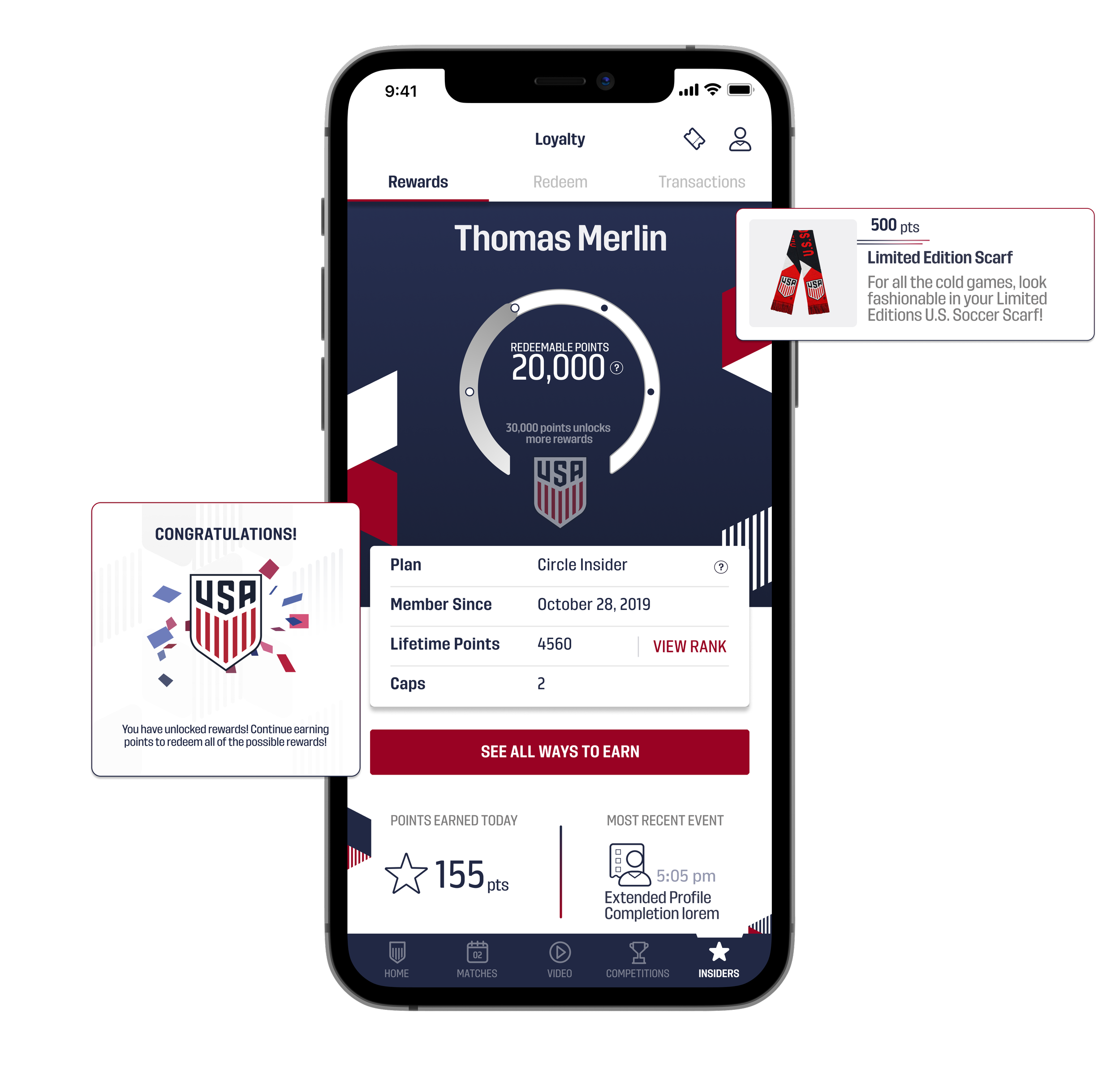
Workshops to full UI: A loyalty program for U.S. Soccer Fans across the world.
U.S. Soccer aimed to boost fan engagement and grow its INSIDER membership by introducing gamification, encouraging fans to earn points through key actions and redeem them for merchandise and exclusive experiences
CHALLENGE
Designed and developed an interactive loyalty rewards feature that allowed users to earn and track points, redeem them for prizes, and view historical data and leaderboards through a dynamic, engaging interface. Within the first month, the feature drove a 25% increase in Daily Active Users and doubled INSIDER membership sign-ups.
SOLUTION
ROLE
Design Lead
TIMELINE
1 year
SCOPE
Android, iOS
TEAM
1 Product Manager, 2 Engineers, 1 QA Engineer.
Key Responsibilities
Conducted strategic workshops to understand and align on strategy.
Led the creation of scalable design systems, wireframes, and animations.
Drove cross-functional collaboration between design, product, and engineering teams to create engaging content.
Created prototypes to illustrate screen transitions and communicate flows.
Drove testing plan with surveys and testing scripts for beta testing over the course of 3 months.
Existing App Overview
The U.S. Soccer App serves as a central hub for fans to follow and learn about the U.S. Men’s and Women’s National Teams.
Since the app didn’t have streaming rights, we had to find creative ways to drive engagement in the original design. Features included:
Exclusive articles and video content for members
Voting for Player of the Match during live games
Access to team rosters and player bios
The Process
As Design Lead, I guided this year-long initiative from inception to launch, helping define the loyalty program and point structure, gathering feedback during beta testing, and overseeing the final rollout.
I collaborated closely with a cross-functional team that included 1 Product Manager, 2 Engineers, and 1 QA Engineer.
WORKSHOPS
WIREFRAMES
VISUAL DESIGN
BETA TESTING
Gathering Information
To establish a strong foundation for the loyalty program, I began by conducting collaborative workshops with stakeholders and distributing user surveys to 200 existing members. These activities helped us define the MVP and shape a point structure that aligned with both business goals and user motivations.
Through stakeholder workshops, I Identified and prioritized the critical features and business goals for the loyalty program:
Increase App Engagement
Increase INSIDER spend
Increase User Satisfaction
WORKSHOPS
I planned and conducted remote surveys with 200 existing members to understand the desires, opportunities, and challenges with loyalty activities and prizes. Through these surveys, we found 3 key motivators:
Users wanted prizes to be ‘worth it’ based on assumed monetary value.
Users wanted something fun and engaging that would challenge them against others.
Users wanted to feel part of an ‘exclusive club’
SURVEYS
Crafting the Experience
Instead of traditional user flows, I created information architecture diagrams to map out desired features and their access points. This approach provided a clearer view of the overall experience and helped align the team around a shared vision. These diagrams allowed developers to begin integration work early, while Product conducted vendor and third-party audits to confirm feasibility.
I conducted light competitive analysis to understand how other sports organizations structure and present their loyalty programs. This helped identify common patterns, and engagement tactics to help create a more memorable and user-friendly experience.
COMPETITIVE ANALYIS
As the lead designer with a strong relationship to the stakeholders, I was given a high level of trust by the client, with minimal constraints which allowed me the freedom to explore and design the best possible user experience.
CREATIVE AUTONOMY
Once we aligned on the core features, I moved into wireframing. I began with low-fidelity diagrams to map out content hierarchy and layout before investing time in detailed UI. These rough wireframes served as a valuable tool for early conversations with developers and stakeholders, helping validate direction and ensure alignment across the team.
Creating rough wireframes allowed me to quickly iterate without getting bogged down in visual details that could delay the timeline. This approach also enabled developers to begin structuring the backend in parallel, accelerating overall progress.
QUICK ITERATIONS
Transforming wires to UI
Using the design system I created, I transformed our key navigation elements into polished, production-ready UI. I incorporated gradients, overlapping elements, and eventually animations to bring the interface to life, creating a dynamic and visually engaging experience that felt both modern and delightful.
LANDING
The landing screen needed to feel fun and clearly display the user’s total points. This is the main hub a user would interact with and had the most amount of information, so visually hierarchy was very important.
I designed a circular tracker to highlight key milestones in an engaging way, giving users a clear sense of progress. While the concept introduced technical challenges due to the complex math required for precise positioning and animation, the developers were enthusiastic about bringing it to life.
Upon opening this view, users could view their gauge animation and show them how close they are to unlocking a new milestone.
I also included space to display recent activities and a prominent call to action to view the program rules and available point-earning activities
I designed color-coded gauges to reflect a user’s INSIDER membership level—higher tiers unlocked more point milestones and access to additional prizes.
Once users accumulated enough points, they could redeem them for fun swag or exclusive experiences. We offered three categories of prizes, which required thoughtful design to account for various states based on what the backend system returned, such as out-of-stock items or limited-quantity.
REDEMPTION
The prize detail screens included descriptions and relevant tags to clearly indicate eligibility and quantity issues, ensuring users understood whether they could redeem an item.
Prizes fell into either physical or digital categories, each requiring a distinct checkout flow to collect the necessary information.
Each prize category had its own visual treatment, so I created flexible design templates to help the marketing team easily generate assets for various placements.
We partnered with Open Loyalty to manage fulfillment of physical prizes and track the status of each item. Using test accounts, we were able to update images, quantities, descriptions, and point values directly in their system, which then synced seamlessly with our app’s prize display.
TRANSACTIONS HISTORY
To reassure users that their actions were being accurately tracked, we introduced a transaction history screen. This feature provided transparency by displaying a clear log of all point-earning activities, helping build trust in the system and reducing concerns about glitches or missed rewards.
PERIPHERAL SCREENS
Using our established design system, we created screens for point rules and bonus activities, while also hinting at future features to gauge user interest and engagement.
I designed the Point Activities screen to help users easily understand how to earn points and engage with the program. Each activity featured a unique icon used consistently across the app for quick recognition.
I also created an initial version of the leaderboard to build excitement around potential competitions and rewards during key events, displaying both total points and the number of games attended.
We also introduced the Ticket Center as part of a partnership with Ticketmaster. This flow allowed users to view presale codes and purchase tickets based on their tier level, with ticket purchases counting toward their point total
ERRORS AND EMPTY STATES
One of the biggest challenges was managing potential errors from third-party integrations. Empty states played a crucial role in guiding users to retry or return later when data failed to load. To keep the experience light and engaging, I incorporated playful illustrations into these states.
Animations
To make the experience more dynamic and engaging, I designed a series of playful animations triggered when users completed their point circle, pulled to refresh, or encountered longer loading times. These small yet delightful touches gave the app a sense of personality and responsiveness, making it feel more alive and user-centric.
New Onboarding
To enable access to the loyalty feature, we revamped the onboarding flow to clearly communicate the value of joining. This allowed us to create user accounts in Open Loyalty, enabling point tracking and integration with their INSIDER membership.
Users who chose to continue as guests could still access live scores and team rosters, but any attempt to engage in point-earning activities prompted them to sign up.
Beta Testing
Over a 2-month period, we tested the loyalty feature with 600 users across various membership tiers. Our focus was on validating the point structure and tracking engagement. During this phase, engagement increased by 30–50%, and we received strong positive feedback from users, confirming the feature’s value and appeal.
APP ENGAGEMENT
72% of users viewed the Leaderboard at least once per week.
14,500 earning events took place across 515 Beta users — 70% were Sweepstakes entries
Transaction Details were viewed by 50% of the Beta audience; The average Beta users returned to this screen once per week.
90% of Beta users viewed the Redeem tab — returned 12 times on average
3% of all app Ticket purchases were from Beta Testers during this period.
FEATURE REQUESTS
Better distinguish featured videos to know which ones earn points.
Earn points for reading articles.
Points awarded for referring friends.
BUSINESS GOALS MET
30-50% daily increase in engagement.
8x more likely to view new content sooner and stay active longer in the app.
23% of beta users clicked the upgrade CTA, resulting in 4% upgrading their tier.
Launch
Our beta testing was a success, with users providing valuable feedback and feature requests that helped us refine the experience for launch. After going live, we observed similar engagement patterns across the broader user base, validating our design decisions and loyalty system. The feature quickly became an integral part of the U.S. Soccer fandom, fostering a community of users who enjoy earning and redeeming points
Personal Retrospective
EVERY POINT MATTERS
Whether it’s the business calculating the value of each point or the user striving to redeem a desired reward, every point matters. Creating a sense of progress and achievement along the way adds meaningful value to the experience for both sides.
KEEPING ITEMS FRESH
Great design and user experience are essential, but keeping the redemption screens fresh and relevant was just as important. Users frequently returned to this screen for motivation and excitement, checking what new rewards they could work toward.
tl;dr
Created a loyalty feature that encouraged users to engage with the app through various point-earning activities, which could be redeemed for merchandise and experiences. During a 2-month beta, we validated key assumptions and gathered insights to refine the experience before launching to a broader audience, which resulted in increased daily engagement and membership upgrades.